


How Expensive Is The S&P 500 Index?
The P/E Ratio (TTM) for the S&P 500 Index is currently about 30x, compared to the long-term average of about 16x. It is also more expensive than most historical peaks. (Note that the 2009 and 2020 peaks in the chart below are a data artifact of particularly depressed trailing earnings rather than inflated prices).

If we smooth out the data artifacts by considering the Shiller P/E ratio (current price over average inflation-adjusted earnings from the previous 10 years), the multiple seems more extreme at ~37x—well above the 1929 peak and approaching dot-com bubble levels.

Looking at another indictor, the ratio of the Wilshire 5000 index to GNP, also suggests historically elevated valuations.

All of this seems particularly unusual given that treasury rates have risen rapidly from historical lows. The earnings yield of the S&P 500 (the inverse of the P/E) is just over 3% using TTM earnings, yet the “risk free” 10-year rate is over 4%.

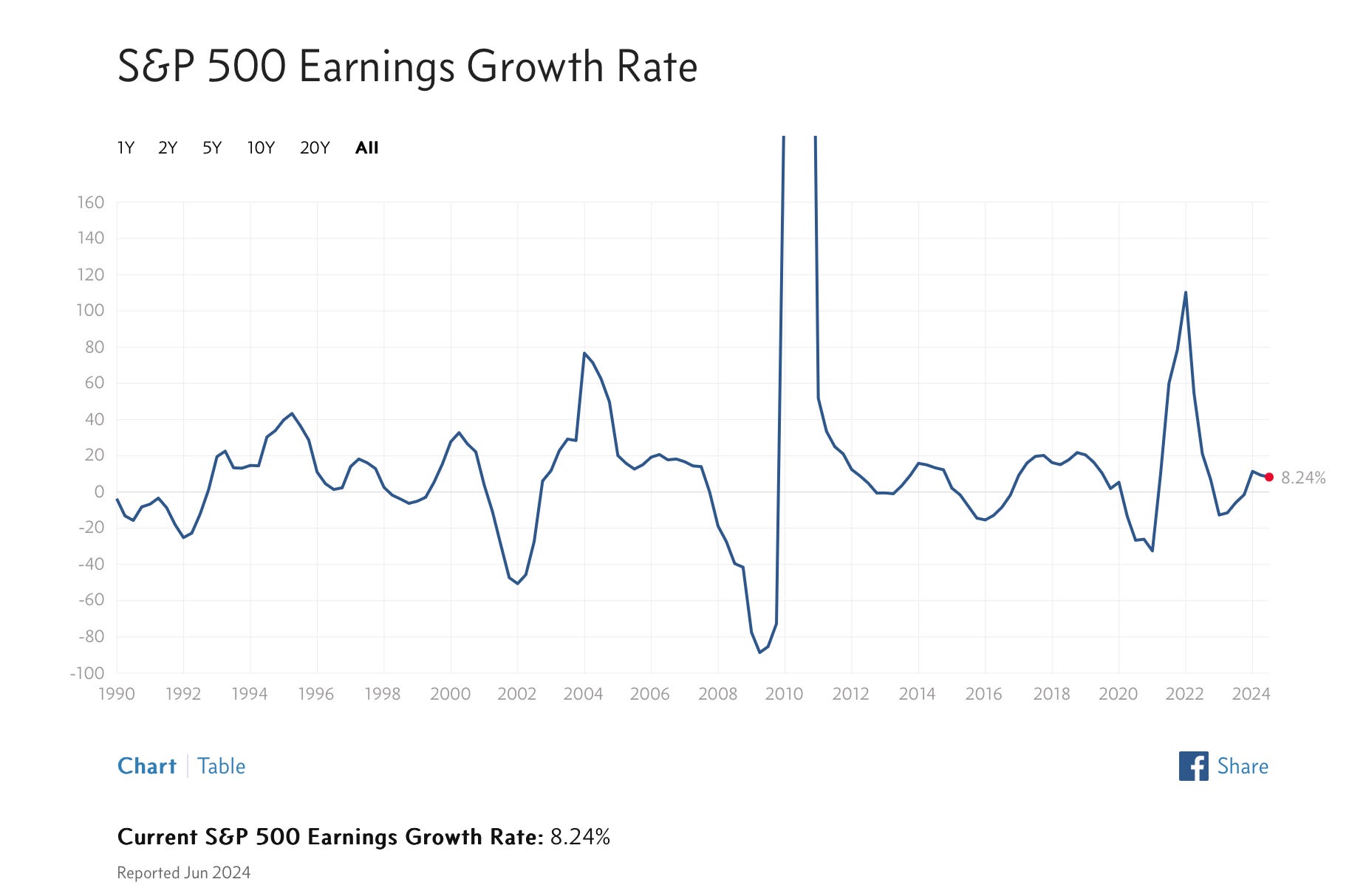
Of course, a low earnings yield can be justified if earnings are expected to grow significantly. Bulls point out that S&P 500 earnings are indeed expected to grow at a very strong mid-teens level in 2025, following expected growth of 9-10% in 2024.
This level of expected earnings compares favorably to the long-term median earnings growth rate for the S&P 500 of ~10% (~8% inflation-adjusted).
Bulls also point out that the expected earnings growth in 2025 is broad-based, at least moreso than in 2024.
Are high earnings growth estimates justified? The overall economy is doing well by most official figures: GDP growth is healthy, employment rates are high, inflation has normalized, wage growth is solid, and productivity growth is robust. I won’t link to a chart for each of those economic metrics; instead read it from an actual economist.
If we value the market based on future expected growth, we finally get a chart that does not look historically overvalued.
S&P 500 NTM PE Ratio Over Time

Looking at forward P/E multiple by industry reveals that some less expensive sectors (e.g., financials, energy, telecom, and major pharma) are offsetting more expensive sectors (e.g., big tech, consumer, medical instruments & diagnostics, industrials, materials).
Forward P/E Ratios By Industry

One concern I have is that the several of the less expensive sectors in the chart above are notoriously cyclical (e.g., financials, energy). Cyclicals tend to have lower P/E ratios at the top of a cycle. However, the COVID pandemic has caused havoc with normal cycles. Several of my upcoming posts, therefore, will take a closer look these less expensive sectors to see if they are truly inexpensive or merely screening that way due to cyclical factors.
In conclusion, the market does look expensive based on trailing metrics. The current valuation must be justified by strong growth in upcoming years. It’s notable that forward estimates have been coming down slightly over the course of Q3 2024 earnings season.

Whether future earnings growth will materialize depends on economic risks. The economy seems good right now, new technology is driving productivity gains, and the U.S. is reinvesting in industrial infrastructure. At the same time, the upcoming U.S. election could be disruptive, rising global tensions the Middle East, Eastern Europe, and Asia threaten stability, and the U.S. federal government is approaching a high point in deficit spending that may not be sustainable.
